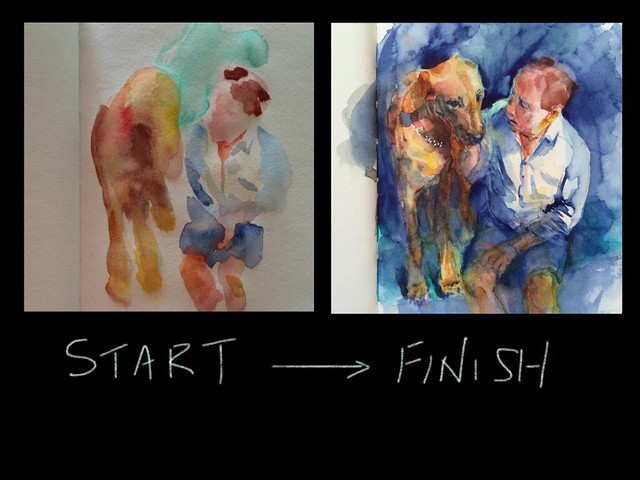
How the watercolour painting was started and finished.
 Written by Ako Lamble
Hi Everyone, Some of you have already known that I had been obsessed with watercolour painting for a while. I would like to share with you the process of how I did the watercolour painting of Mike and Henry in my sketchbook.
I was very surprised to know that I received so many good responses when I posted the painting on my Facebook. More than 230 people altogether clicked Like button (I posted it on a couple of art groups on Facebook as well). Never happened that many before. I presume that so many dog lovers were out there and the painting touched a soft spot. Also comments such as how they liked the tones and the sensitivity of my style of painting.
I will tell you that there were mistakes and happy accidents during the process which lead to discovering new techniques, I loved the experience. That’s why watercolour is so addictive for me.
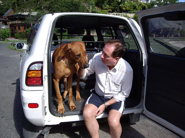
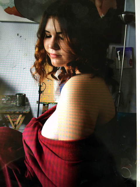
Mike and Henry(rhodesian ridgeback) in 2006.
This is the photo I chose and put up on my computer screen for a reference to paint from. I wanted to test the new colour arrangement of my travel palette so I picked the photo without thinking too much.

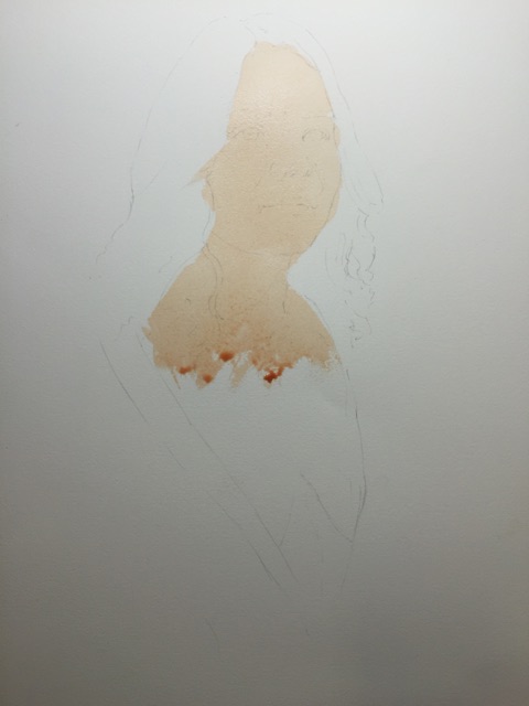
At this point, I just wanted to test the colours.
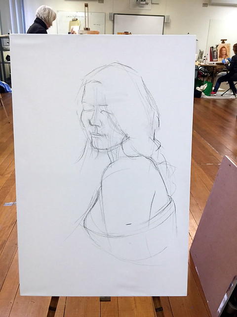
I usually do a pencil drawing or pen drawing before applying the colour to the paper, but this time I just wanted to test the colours, so I went straight to paint. I make a lot of colour swatches in my sketchbook, so I thought this was one of them, then I went to bed.
Next morning, my mind and eyes are as fresh as the morning dew. When I saw the paint marks in the sketchbook which I made the previous night, I thought I could do much more, so picked up a 2B pencil and started drawing over it, then put more colours on it. Oh, by the way, around 30% of the intensity of the colour would be faded when the paint has dried.

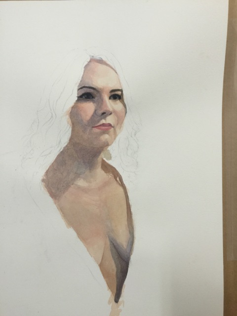
I was struggling to shape Mike’s hand and arm.
I started using some watercolour pencils to draw details. This was the area you can see where I was struggling to shape Mike’s hand and arm. I also realised that there was not enough space between Mike and Henry and Mike was slightly smaller than the actual size.
I tried to ignore Mike’s arm and carried on the areas I could deal with.
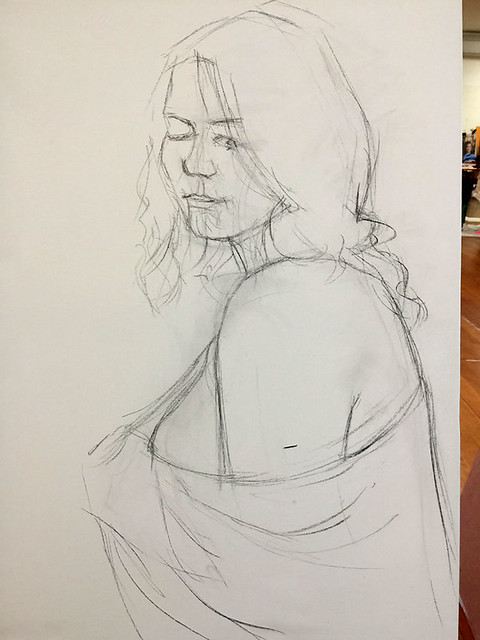
I have a good habit of taking photos of my painting/drawing with my iPhone during the process. Not just for sake of keeping records, I do it for checking my painting. It’s much easier to find the faults when you see it in thumbnail size. Checking the values, shapes and even colours.

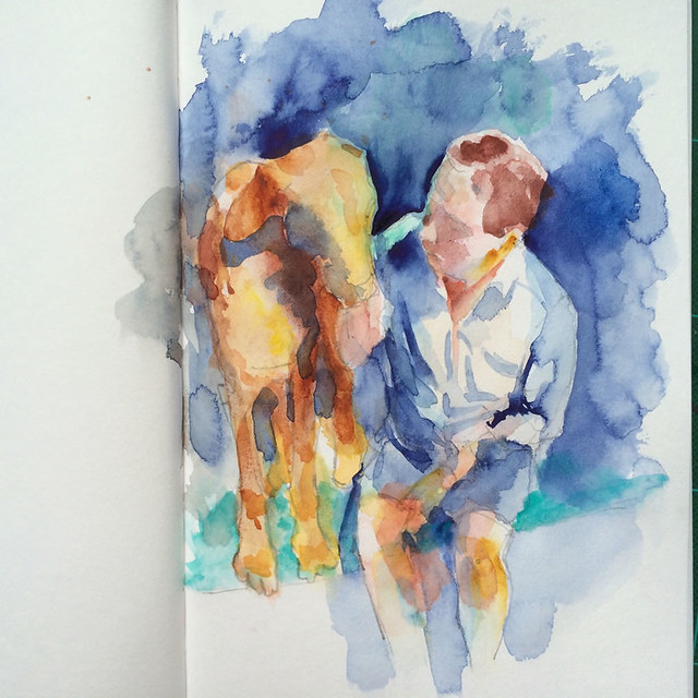
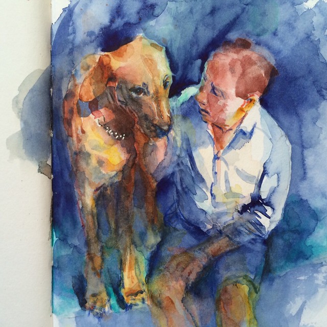
This is the painting I posted on my Facebook and received more than 230 clicks on Like button.
Now, this was the point the happy accident had happened. When I saw the painting through the iPhone thumbnail size, I instinctively dropped a generous amount of the background colour over Mike’s arm, I actually did it holding iphone in my left hand and holding a brush in my right hand.
You don’t know how excited I was, I knew I did the right thing. Not just hiding my crappy drawing but it gave a clear focal point on Mike’s face.
I stopped there and posted it on Facebook. I don’t know exactly, but it took about 40 min to come to this point since I started a pencil drawing that morning.

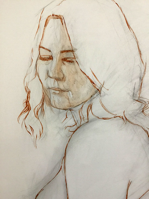
I used Procreate app with iPad to paint shadow over Henry’s legs to see how it looks like.
Since I decided to write about the painting, I wanted to do a little experiment. This is a good chance to use the iPad to simulate the casting shadow over Henry’s legs before actually painting on it. I was quite happy with the result.
You can lift some colours from the watercolour painting.
I mainly did three things;
- Darken a part of Henry’s legs as if there were a casting shadow.
- Lifted some colours and painted lightly Mike’s arm and hand which was diffrent form from the photo.
- Put more details of Henry’s face, including highlights (with a gel pen) and his collar.
So many people think that watercolour is difficult and unforgiving, but I disagree with that. As you see, I could redo Mike’s arm and hand after covering the dark colour. Yes, there are some restrictions but watercolour is much more versatile than you may think.

Left:the one I posted on Facebook. Right: The final piece.
I’ve employed a new habit of asking myself two questions each time when I finished my painting/drawing. I encourage my students to do the same in my class.
Q1. What is the most I like about the painting/drawing?
Q2. What is the most I would like to improve about the painting/drawing?
I will answer the two questions on this piece.
A1. I liked/enjoyed when I instinctively painted over Mike’s arm, it worked well to hide my crappy drawing, also to give a clear focal point on Mike’s face.
A2. Definitely better drawing of the hand!

I have a few different sizes and shapes of sketch book. I keep “in-case sketchbook” in every places.
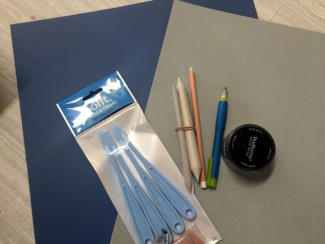
Art materials I used
Some of you might want to know the art materials I used, here is the list of them.
From the right to the left shown in the above image.
- Sketchbook: Stillmand & Brin Alpha series 150gsm A5size
- Mechanical pencil: 2mm 2B
- Watercolour pencil: Caran d”Ache Museum Aquarelle (3510 640) Dark Ultramarine
- Watercolour pencil: Caran d”Ache Museum Aquarelle (3510 661) Light cobalt blue
- Watercolour pencil: Caran d”Ache Museum Aquarelle (3510 850) Cornelian
- Watercolour pencil: Caran d”Ache Museum Aquarelle (3510 009) Black
- Watercolour pencil: Caran d”Ache Museum Aquarelle (3510 077) Burnt Ochre
- Round Brush: Escoda Kolinsky Sable Pocket Size 8
- Aquarelle Dagger Travel Brush 1/4″
- Uni-Ball UM-153 1.0mm Broad gel pen WHITE ink
- Watercolour: My current travel palette 23colours.
- Helio turquoise: Shcmincke (PB16)
- Phthalo green: Daniel Smith (PG7)
- Ultramarine blue: Daniel Smith (PG29)
- Perylene maroon: Daniel Smith (PR179)
- Cerulean blue chromium: Daniel Smith (PB36)
- Cerulean blue: Daniel Smith (PB35)
- Quinacridone burnt scarlet: Daniel Smith (PR206)
- Delft blue: Shcmincke (PB60)
- Goethite brown ochre: Daniel Smith (PY43)
- Transparent red oxide: Daniel Smith (PR101)
- Lunar black: Daniel Smith (PBk11)
- Cobalt teal blue: Daniel Smith (PG50)
- Translucent Orange: Shcmincke (PO71)
- Transparent pyrrol orange: Daniel Smith (PO71)
- Pyrrol orange: Daniel Smith (PO73)
- New gamboge: Daniel Smith (PY153)
- Hansa yellow medium: Daniel Smith (PY97)
- Translucent Yellow: Shcmincke (PY150)
- Quinacridone gold: Daniel Smith (PO49)
- Indian red: Daniel Smith (PR101)
- Pyrrol red: Daniel Smith (PR254)
- Opera pink: Daniel Smith (PR122)
- Quinacridone gold: Daniel Smith (PO49)
I hope this blog artcle will inspire you to do watercolour if you haven’t done for a long time.
I started my watercolour for beginners weekly classes on Tuesday afternoon and Friday afternoon. Also The workshops on Saturday will begin. If you are interested in joining, let me know (info[at]art-art.com.au).